

Every believable world is full of brands. From local Mom and Pop shops to Global Corporate Identities. The soda in someone's hand, the corporation that owns the station, the faction stenciled on a crate, the network logo burned into a TV in the corner of a ruined room. We read them the way we read the real world, instantly, subconsciously, as proof that a place is real.
As an Art Director, I treat brand identity as foundational world-building. Developed at the front of preproduction, not tacked on as an afterthought. Thoughtfully integrated into the world-building process. A suite of brands that tell a story about the world that surrounds you, and the reason that fictional world feels grounded, relatable, and whole.
The discipline doesn't change with the medium. Whether the world is a game, a film, or a real company, the work is the same: build the system early, integrate it deliberately, and make everything around it narratively cohesive.
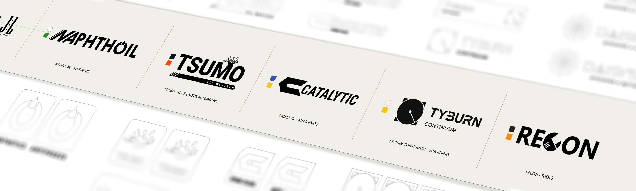
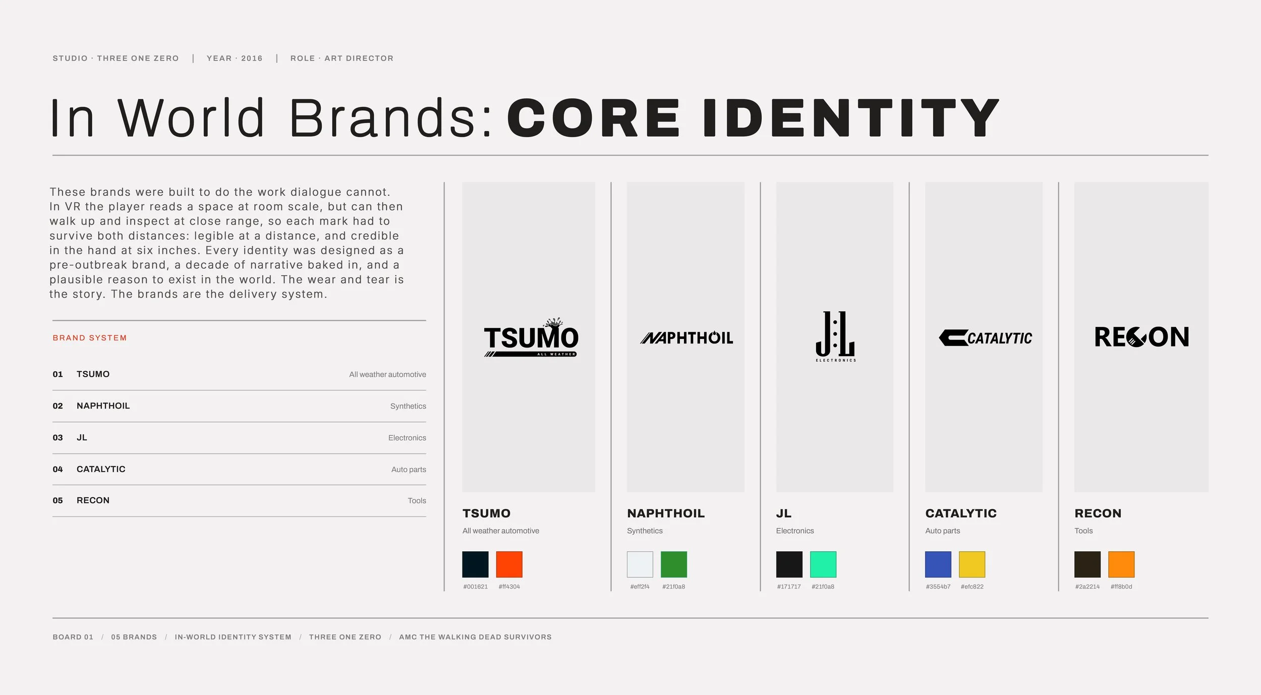
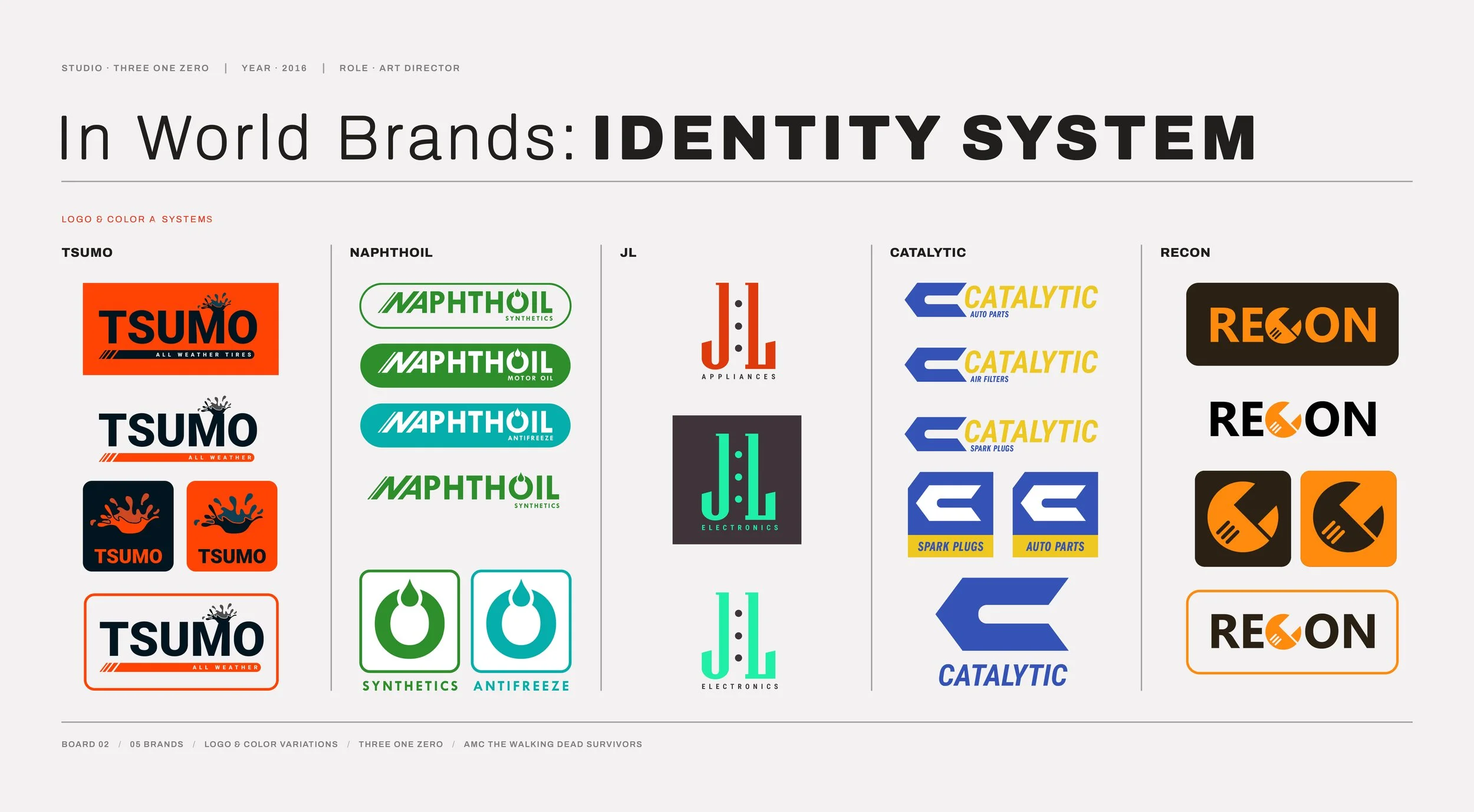
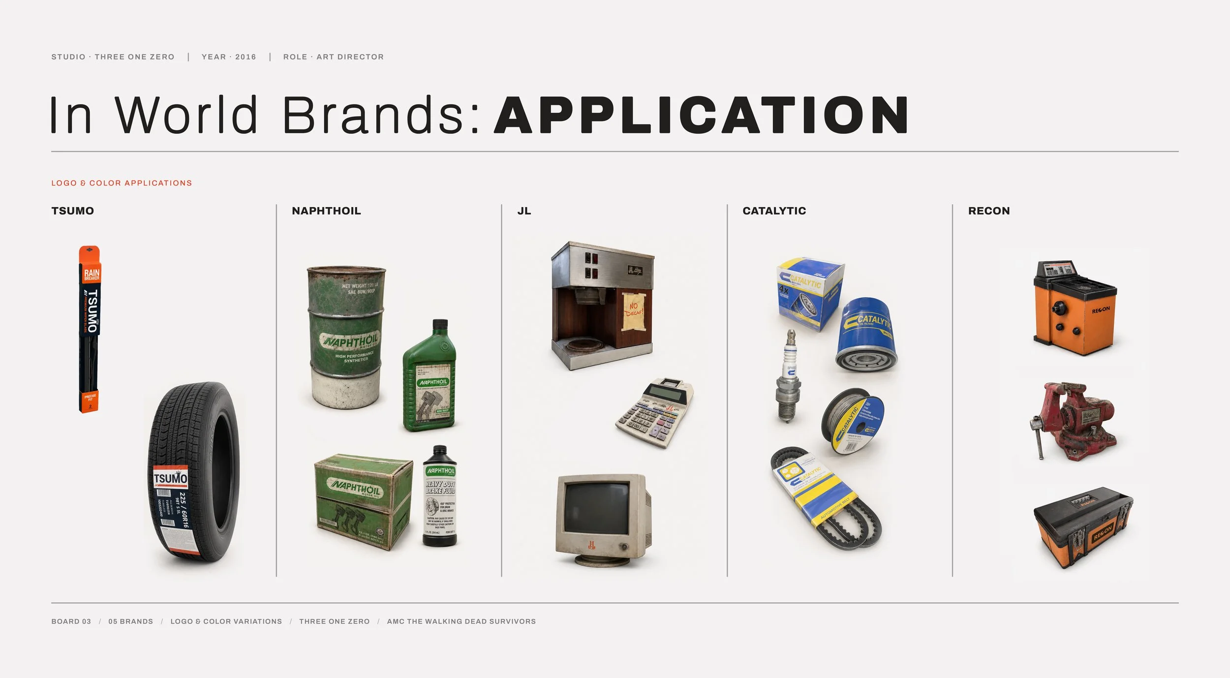
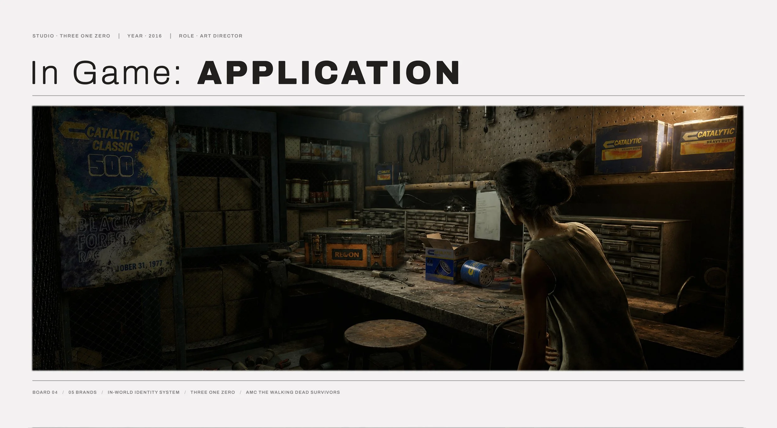
A sample of in game brands developed for the unshipped Walking Dead VR title for the Oculus Rift.
Every real place has a commercial layer. A logo on a fuel canopy. A faded decal on a shop grate. A sponsor's mark on the flank of a race car. Players never stop to read it, but they feel its absence immediately.
As Environment Art Director, I brought brand development onto the production as a discipline with its own pipeline, standards, and long-term ownership, rather than a dressing pass at the end of a production pipeline. The case I made for it was that logos, signage, and packaging are lore. They record who operates where, who sells what, whose product reaches which shelf, and which companies have the scale to sit at the edge of a war without being part of it.
A universe that stages real conflict across real geography needs a fictional commercial landscape underneath it, and that landscape has to be authored with the same rigor as any real world brand system. Treated that way, brands become canon. They carry backstory. They accumulate meaning across appearances. They persist between maps, modes, and sequels, and they give the world a texture that no volume of set dressing produces after the fact.
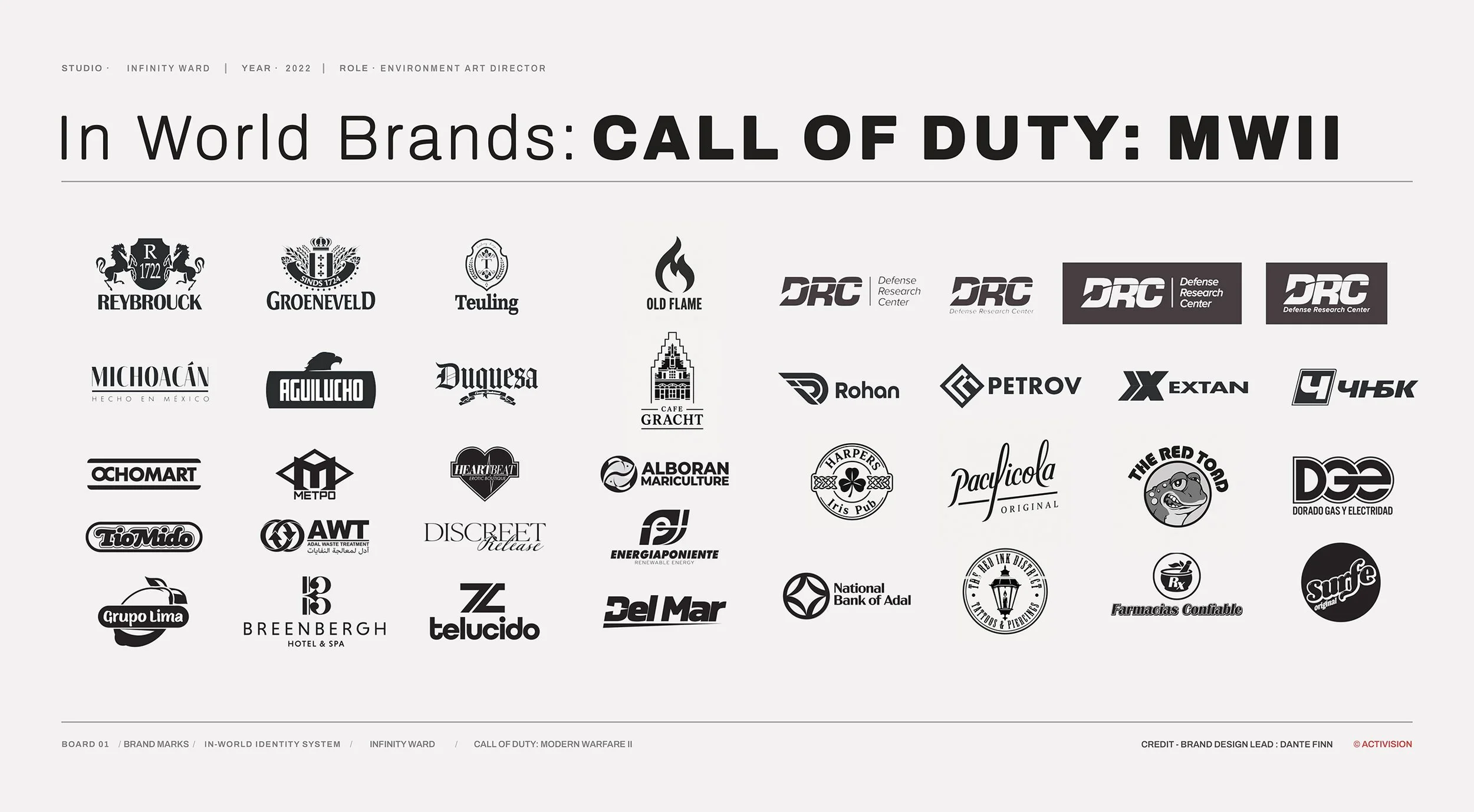
What follows, although just a fraction of the brands developed, is how that system was built to work in three directions at once: Landmarking and player orientation, carrying the tone, and keeping the universe continuous.
Hero signage does structural work before it does decorative work.
A player crossing unfamiliar ground needs anchors, and a large, distinctive mark reads faster than architecture does if the architecture isn’t particularly noteworthy. In multiplayer that need runs constantly and under pressure. Orientation has to happen at a sprint, in peripheral vision, from any approach on the map.
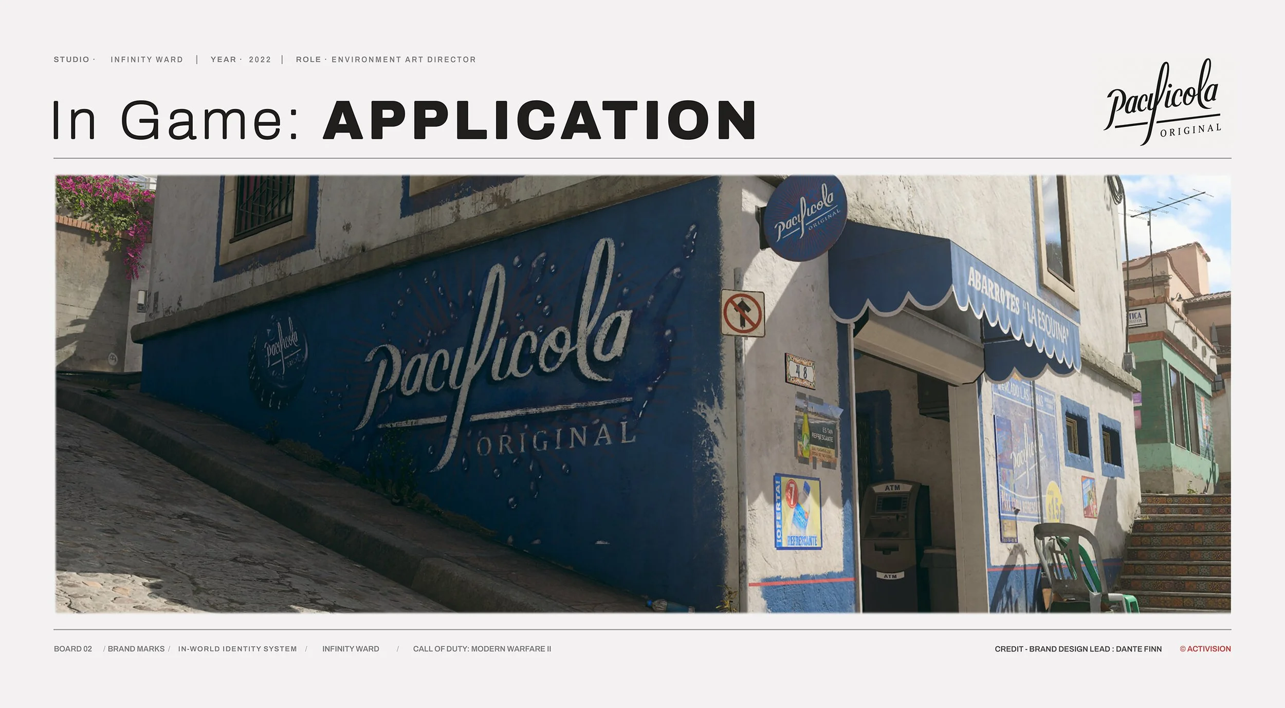
Punta Mar is a fictional Mexican seaside town, drawn from Puerto Vallarta. One landmark anchor is a small neighborhood bodega on a corner, with Pacificola painted across the entire flank of the building.
Scaling the brand to the wall rather than to a single sign is what makes it work. A soft drink identity in deep saturated blue, set against sun-bleached stucco and cobblestone, turns a one-room corner store into a structure you can navigate by from the top of the hill. It reads at distance, reads in silhouette, and reads when the player is looking somewhere else entirely.
Once a mark carries that much weight, it stops being decoration and enters the map's spoken vocabulary. Nobody calls out the corner building on the north lane. They call out Pacificola.
Brand Design Credit: Dante Finn
The visual target for MW II was filmic and grounded. Hero signage and motion graphics carry a lot of that weight, but they only land when the layer beneath them is complete.
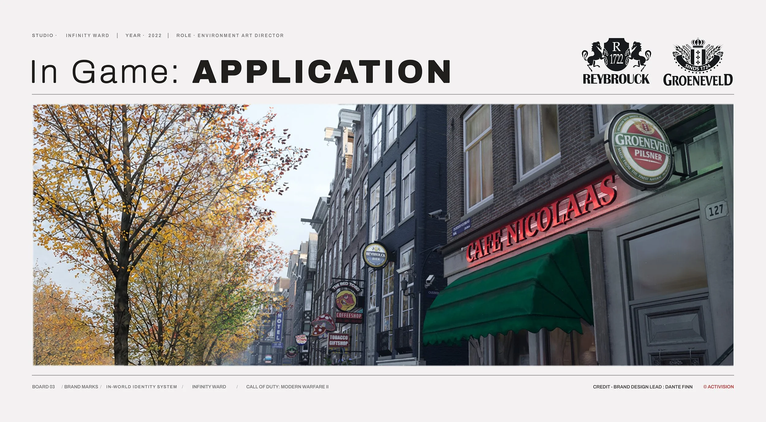
This street is Amsterdam. Every brand on it is invented.
That gap is the work. The location was studied closely — high-resolution 360 video capture served as the reference base for our Amsterdam builds — but the entire commercial identity of the street had to be authored from nothing. A purpose-built library, deep enough to fill a block where the signage feels natural. Calling attention to itself only when intended. Projecting cafe neon. Bier discs on their own brackets. Coffeeshop marks, tourist tobacco windows, a hotel arrow receding down the block into the fog. Amsterdam runs dense, and any thin patch in that density reads instantly as a set.
The reference gets you the street. It does not get you the businesses. Every mark in frame is invented, and each one was authored with a business standing behind it: what it sells, who it sells to, how long it has been on that corner. The brands also sit at deliberately different scales. Groeneveld Pilsner is a regional product that turns up wherever it's poured. Cafe Nicolaas exists on exactly one block. That spread of scale is what separates a street with an economy from a row of props with logos on them.
Regionally, culturally, and economically legible at a glance — that's the target. Get it right and the player stops evaluating the environment and starts being immersed in it.
Brands were developed for the universe, not the simply the map. Every identity was built on the assumption that it could eventually need to appear anywhere in the game, in any mode, in any future title, and still read as native.
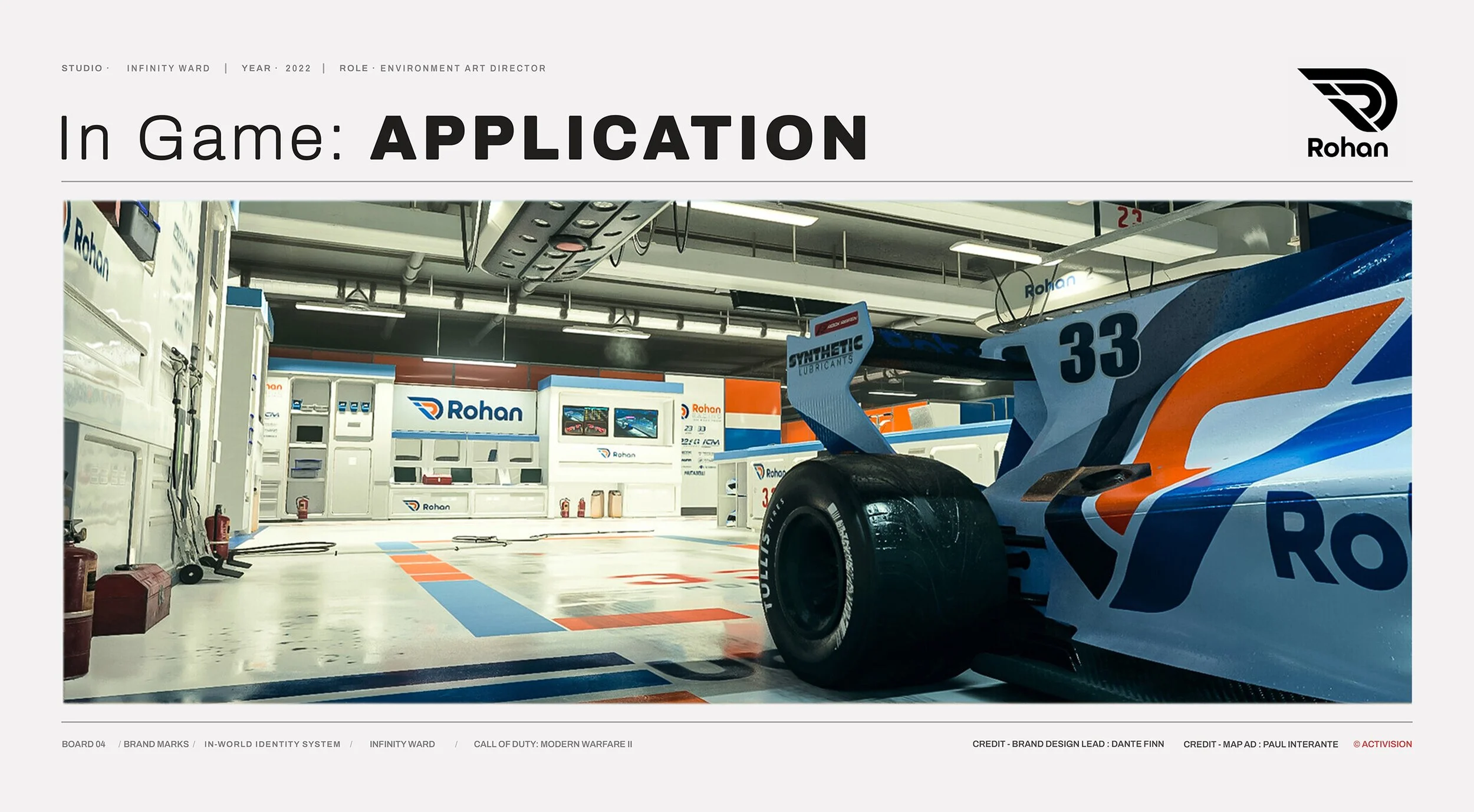
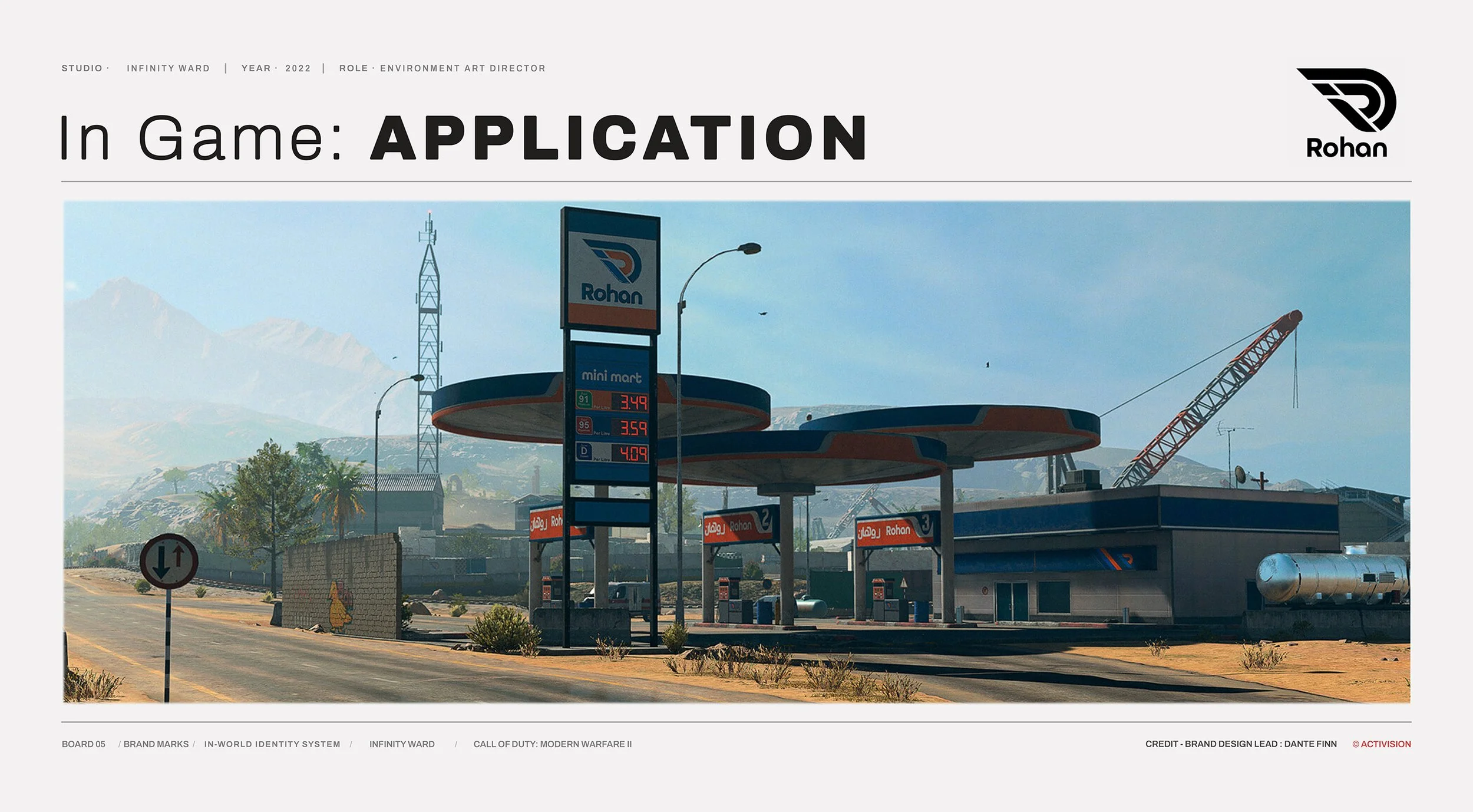
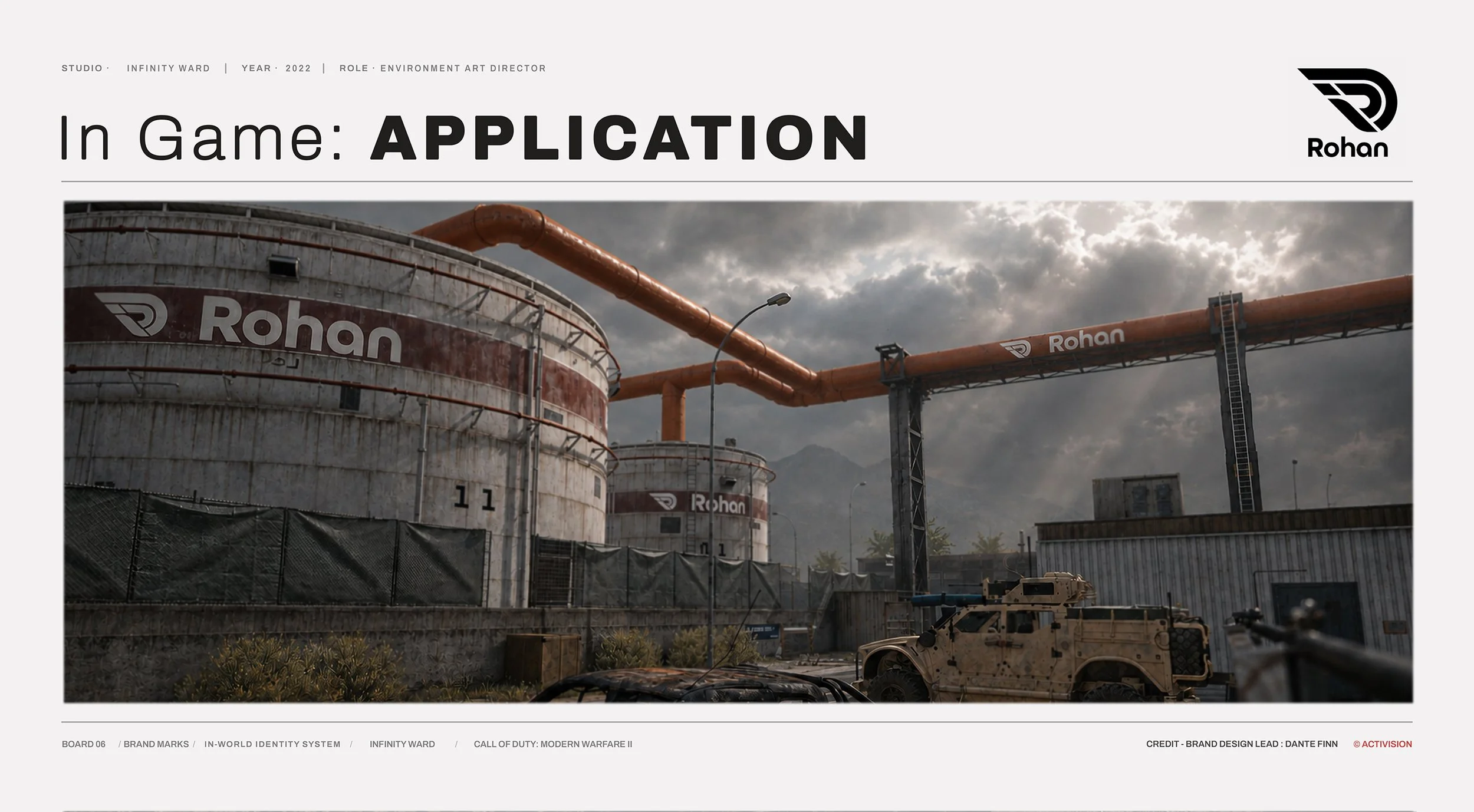
Rohan is the clearest case. A global energy supermajor: one of the handful of companies that owns the entire chain, from the well to the refinery to the pump, and puts its mark on every link of it. Rohan was built to sit at the tier of recognition occupied by BP or Shell — the kind of company whose logo you'd expect on a refinery, a forecourt, a tanker hull, and a Formula 1 sidepod without giving any of it a second thought.
With a globally recognizable brand identity, a company built like that has a reason to be everywhere, which means the mark does too.
In Warzone, Rohan is a refinery complex and a chain of fuel stations. In multiplayer, it's a title sponsor on a race car. In campaign, it's background signage on the other side of the world. Different continents, different modes, different production teams, one mark and one set of rules. A brand built at universe scale never gets transplanted into a new environment. It was meticulously planned to be there from the start.
Brand systems built this way compound. They hand the art team a library of pre-solved decisions instead of a new logo problem on every map. They reward players who pay attention across releases with continuity that withstands titles and different dev studios. And they let the world keep expanding without ever losing its accent.